Native ad builder on Layout level now
We have kept the same settings ato our Native Ad Builder, bringing a few improvements:
- you can preview your ads both when creating and editing the layout.
- see the changes to your native design in real time.
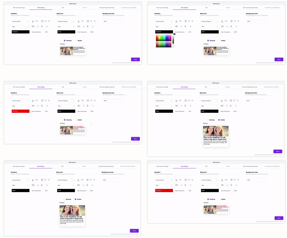
- if you build your layout with two formats, you can edit the desktop and mobile native design in one flow
Instructions:
Go to Layouts > “[Layout Name]" > Edit > Styling Property. Then follow these guidelines:
1. Main layout settings
In this tab, you can do basic setup of the layout: add a corresponding name and format(s) - Only one format is required.
 Important: New Native Ad Builder Preview - Only for layouts with both formats
If you are building a responsive layout, with both formats, when styling the layout, you will have the option to style both Desktop and Mobile. Important to note that the settings from one frormat will not be applied to the other format. For example:
2. Text styling
Note: All of these new options apply to both headline and body text separately.
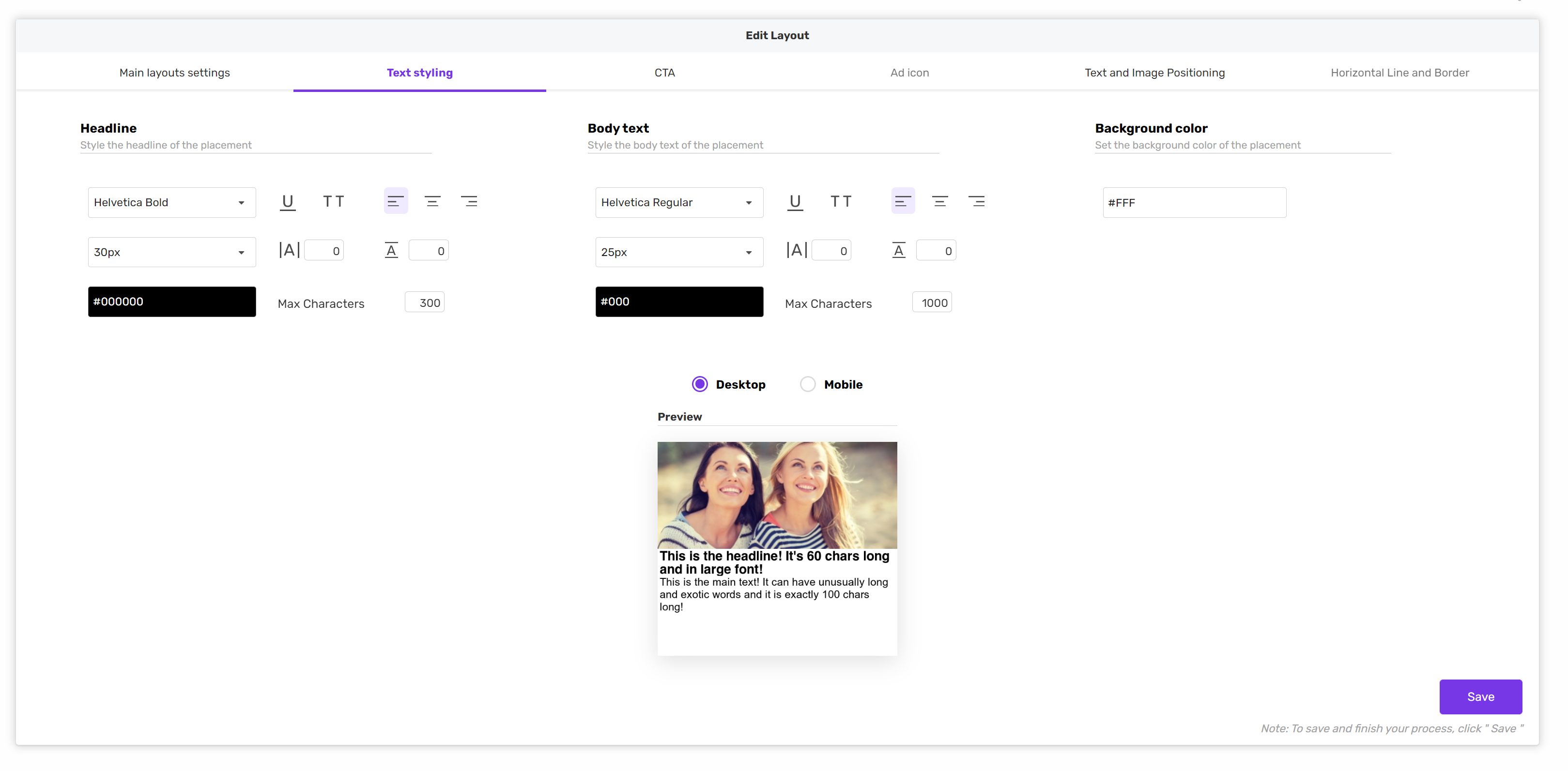
New options for styling the text are:
- Text underline
- All caps - caps lock
- Left, center and right alignment
- Letter spacing - space between letters
- Line height - option to add additional spacing on the top and bottom of the lines.
- Max characters - the limit in the number of characters in the headline you want to set to be visible. Meaning, if the real headline has 80 characters but you set the max to 50, you’ll see three dots after the limit has been reached.
- Background color - refers to the background of the text field in the ads.
3. CTA
Note: when enabling the CTA, it's essential to define 0 or false for the variables that have default values.
CTA tab will allow you to style text elements, button, spacing, and position of the CTA itself.
- Text styling would be the same in this case as in a previous tab, the difference would be the button and its styling.
- Border height and radius allow managing different appearances of the CTA itself.
- Button shadow, color, spread and opacity can be used to set a shadow behind the element that’s created in this setting. The size of the shadow will be the same as for the CTA but the spread will decide on the distance and basically how much the shadow will be visible. Opacity sets how transparent shadow is.
- The position of the button can also be left, centered and right aligned.
- Padding applies on the inside of the button, vertical and horizontal settings will adjust the space around the element’s content, meaning also if adjusted it will affect the width and height of the button too.
- Margin adds space around the button that potentially can adjust its position.

4. Ad Icon
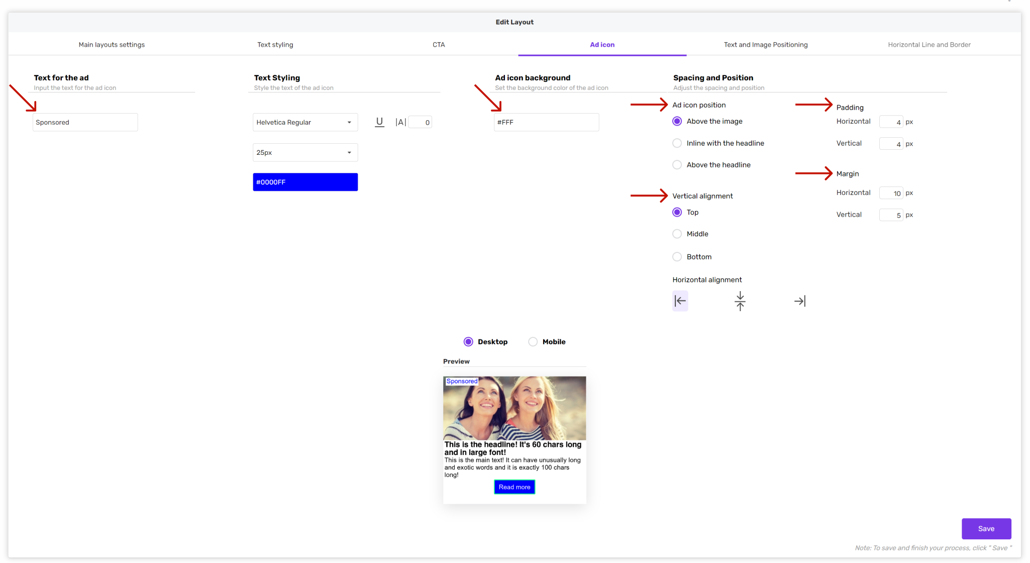
- Text, text styling and ad icon background options refer to the elements of the ad icon content when it comes to its appearance.
- Ad icon position, vertical and horizontal alignment refer to the position of the ad icon,
- Padding adjusts space around the content and
- Margin adds space around the ad icon.
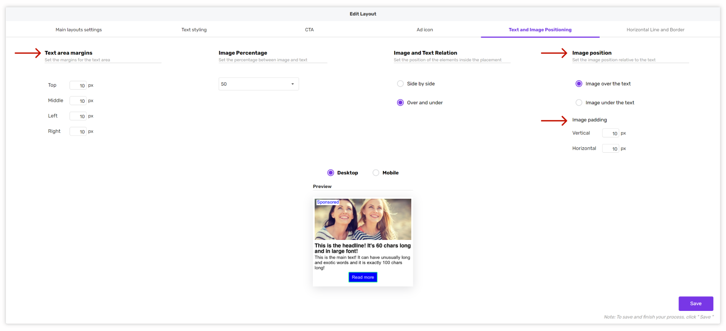
5. Text and Image positioning
- Text area margins give an option to add a margin around text, the top option will push the text down, middle adds space between the headline, main text and button if exists and left and right,
- Image padding will allow you to add space between the borders of the ad position and the image inside of it.
6. Horizontal line and border
The last tab can also add a horizontal line within the ad position and border around it.
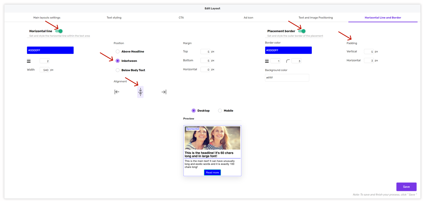
- A horizontal line or divider can be configured as in the screenshot below with adding values to size, font, position and alignment,
- Placement border, as a second additional option in this tab, can add the space or frame between the content and edges of the ad position again by assigning the values to the colors and vertical and horizontal padding.
